Design and layout a text-heavy, larger-than-average, two-colour, soft-cover book that is easy to navigate.
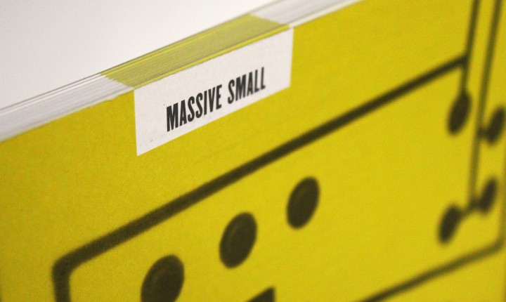
This image shows the cover’s title block, which is echoed on each page as a numbering space.
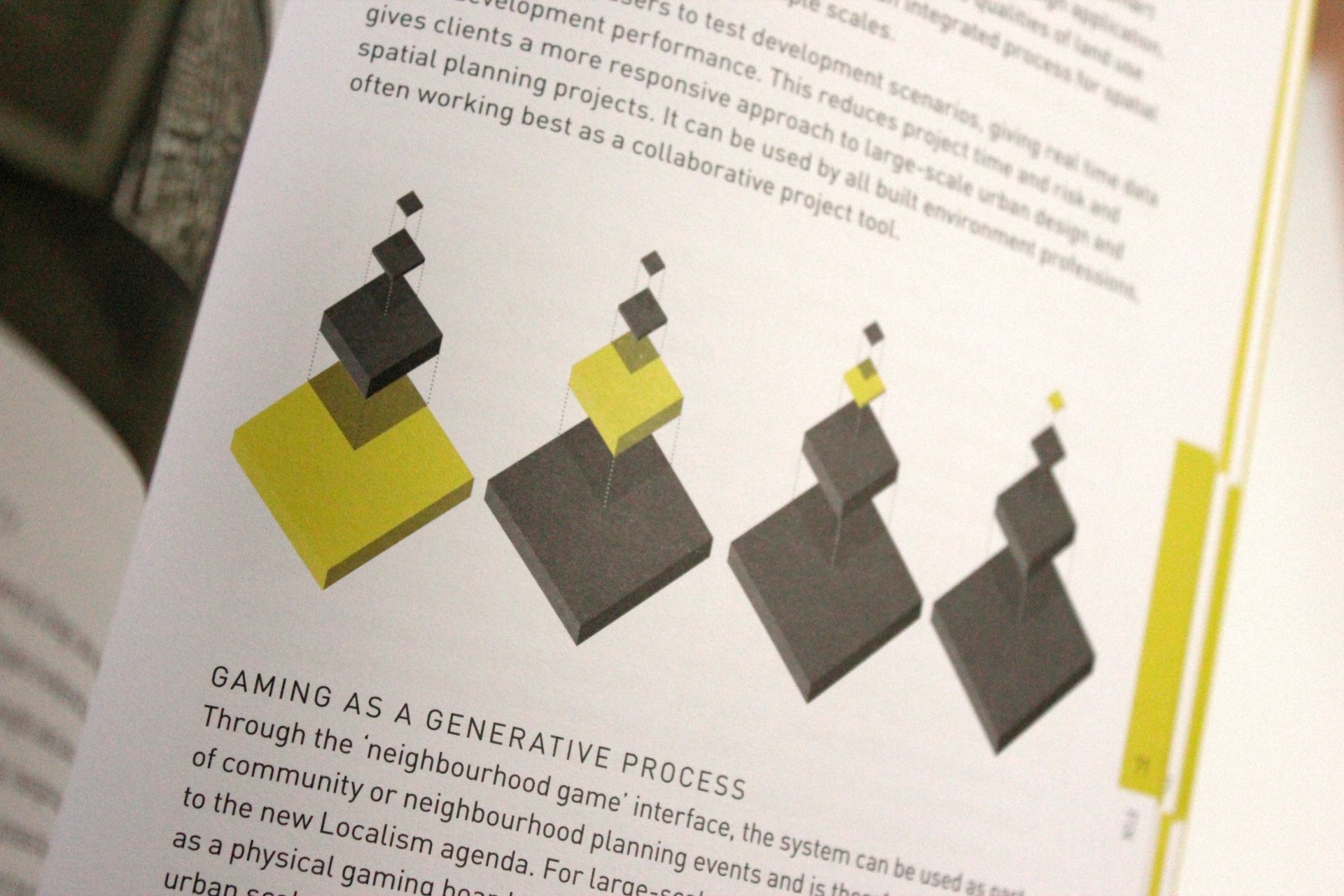
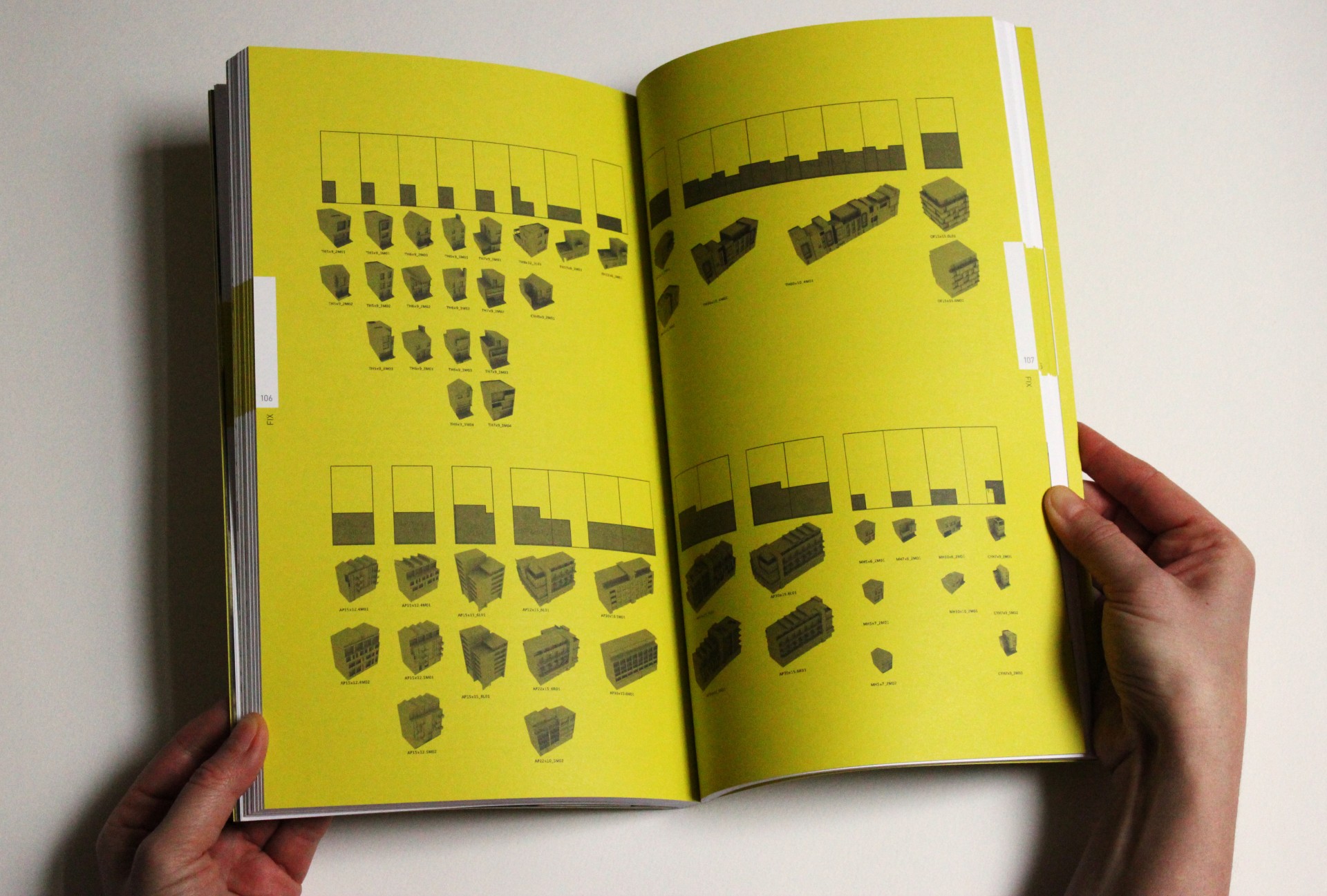
All diagrams were generated in two colours.
Here is a standard text page layout with two wide-format image strips.
Here, the text and image spaces are inverted, allowing for more playful and open use illustration on the page.
These spreads were made green in order to make them easy to find. There is no body text on these pages, only images or illustrations.
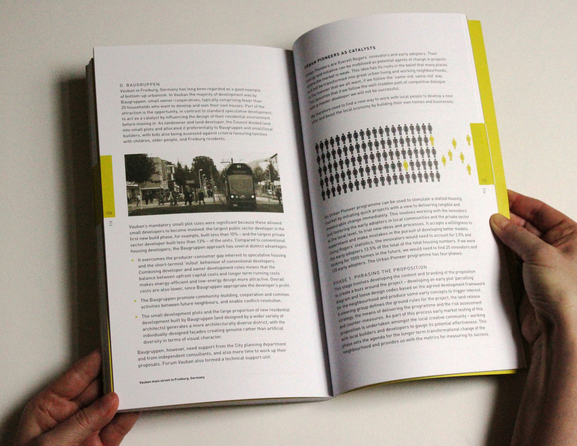
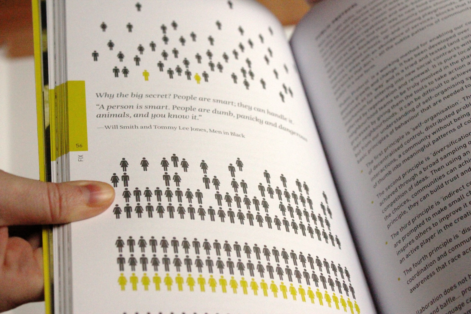
A text spread with alternate use of images, though still adhering to the book’s grid.
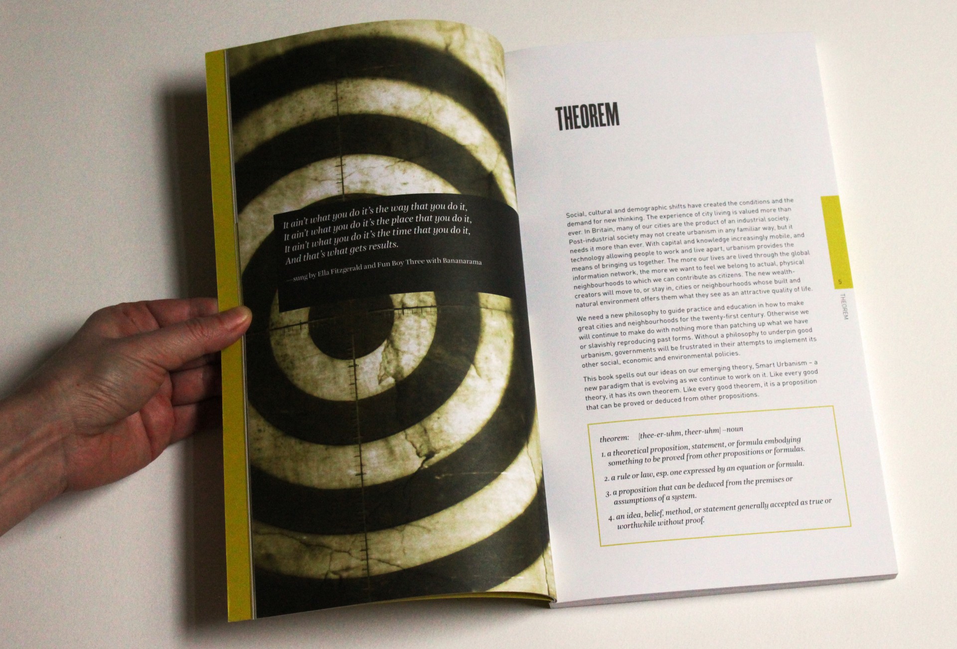
Chapter breaks are marked by a full-page image and quotation.
The massive Small cover uses a micro circuit to make reference to computers or operating systems, as the book aspires to be an operating programme/system for smart urbanism, a platform.
Solution
The result is a pragmatic and utilitarian page layout with page number and chapter names along the sides—right about where one’s thumb would rest while flipping through the pages—for clearer navigation. Use of a neutral grey and accent colour helps draw attention to the important details in illustrations, info boxes, and so on.