Two good friends of mine embarked on an insane bike tour. Rightly, they wanted to document it and spread the word. Logo and website ensued.
The logo was my first mobile-first logo, and was designed solely for use with the Punctures and Panniers website. It is very scalable, looking good even at 16px .
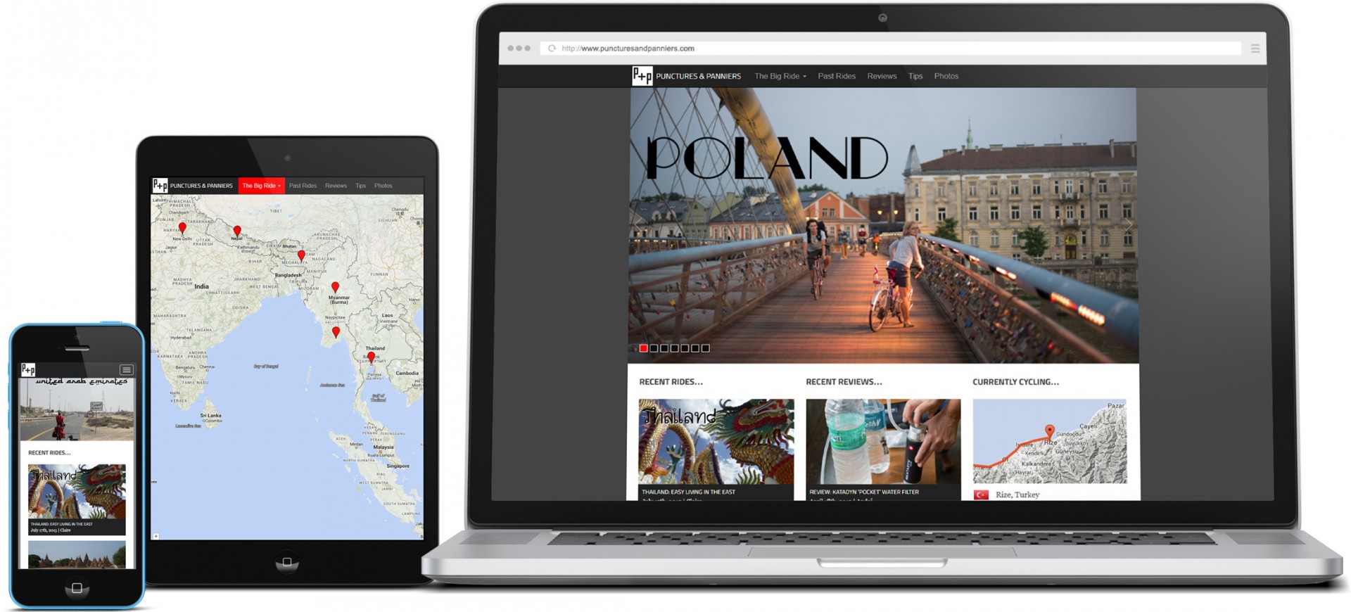
As mentioned above, the website is wordpress-based. The theme was built-up from Eddie Machado’s excellent Bones starter theme. Further customisations include:
- responsive thumbnail grid on homepage and archive pages;
- overriding the WP gallery shortcode to display a Galleria slideshow;
- post geo-tagging (manual), which displays all posts as pins on a Google map;
- Realtime GPS tracking and plotting to the Google map; and
- Realtime trip odometer based on GPS data.
After the site had been live for a while, it was clear that the volume of images (especially those pulled from Flickr) were causing some very slow page-load times. To remedy this, I implemented a modified version of Luis Almeida’s light-weight Unveil lazy-load script for both images and Galleria galleries. The improvement dramatically reduced initial load times, which greatly improved the user experience.