Brief
Develop a logo for Vancouver-based portrait photographer.
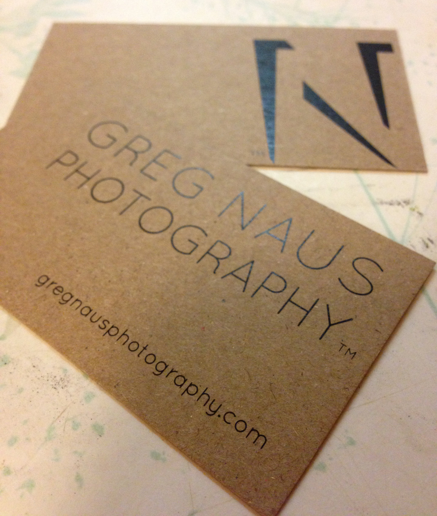
Solution
I decided early on that the logo needed to be black and white, not in a nostalgic, old-world film way, but rather because a neutral, two-tone logomark would be the most versatile and complementary when accompanying a wide range of colourful images.
Given the nature of Greg’s work, the role of lightplay in photography, and Greg’s interest in negative space, I built the logo as a cast shadow, which essentially makes the logomark a portrait of itself.